")
Exploration
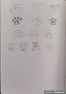
Draw thumbnails of the element for the logo, post as scanned PDFs
Title

Focus
Choose three thumbnails to focus on and state why. Hand in with visuals and reasoning.
I chose these three because I felt they had the most prospect of turning into a great logo, and they also fit the name I chose for the company: Happy bites.
The first one is an image of a cute (and happy dog) that will make people easily understand what the company is about, and make them feel good.
The second is of 2 dogs hugging. This I thought would be refined into one form and show that the company cares about the dogs.
The third one is a play of the H in the name where a dog is sitting inside the H.

construction
Now choose and redraw one. Here I decided on the 1st option as I found it to be the most fitting for the brand, also my children’s favorite.
testing
Ask people what they think and write down your findings.
I asked my children, and they felt the dog would be super cute, and fit well with the brand. They also felt I needed to add a happy color, as most companies that deal with pets have that. I took this into the next phace where I defined the logo.
refinement
Choose your final design and refine it in adobe illustrator.
I started using the full dog face and tested different ways of making it work, but it did not feel right. I played around with it and ended up using negative space for the face, only showing bits of the dog, enough to make it clear it was indeed a dog. It was still super cute, but now felt more like a logo. I tested different colors and layout with text. I also added paws.
Title

Title

Title

Title

Title

Title

Final Logo
I used the font Let’s Corgi, a proper dog font that makes you feel good. I chose a green to be used on HAPPY in the logo name, and also for the dot in the i. I thought about making the dot a dog treat, but when trying, it felt like too much, and I ended up not using that. The B and S in Bites has been taken a chew on, which adds to the companys purpose; making dog food.
After some feedback from teacher, I changed the typeface to Jonesy script regular.
I also made a line logo.