
Brief:
Surf the web and pick three websites to work from:
- A non-profit organisation (for example a charity that cares for the homeless)
- A retailer (for example a clothes or flower shop)
- A service provider (for example a hairdresser, accountant or builder)
Answer the following questions for each of the three websites:
- What do you think the main goal of the website is?
- What elements in the design are helping the users meet the website’s goals? (Look at the calls-to-action, navigation, and other design elements.)
- Who is the main target audience? Name at least five characteristics that define this group of people.
- How was the design used to attract this group of people? Discuss things like colour, font choices, photography or images, style and layout.
- How did you perceive this brand and its overall brand image? Was it serious and conservative or light-hearted and vibrant? Use your experience on the website plus any previous interactions you’ve had with the brand to motivate your answer.
Post your answers and a working link to each of the three websites to your WordPress blog. You can include screenshots to explain your answers.
Non profit organization; Kirkens bymisjon
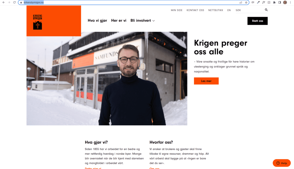
- I believe the main goal of kirkens bymisjon and in particular, this website is to raise awareness of people less fortunate and try to get other people involved in building a better tomorrow.
- Their CTAs are few and to the point; what do we do? this is where you find us, and get involved. They also have a post on the landing page that changes according to current events. At the moment it is about the war that is happening in Ukraine, and it invites us to read more. The navigation on the site is simple and easy to follow, and you get where you want to be in a few clicks. The design elements hold true t their profile, and they only use their well-known orange and their logo. The color reappears on important CTA buttons.
- Their target audience is adults who want to help other people, regardless of race, age, gender, difficulties etc.
-They actively wish to help others
-They often work in health and community
-They’re honest.
-They’re forgiving.
-They show generosity.
-They show an interest in others. - The orange color is familiar to people as kirkens bymisjons color, they walk the city and hand out orange scarfs in winter for example. Font use is clear and consistent and easy to read, and layout is simplistic. The Image they used here is not particularly inviting, but the big bold headline next to it is. However, digging deeper into the site, going to; become a voulenteer f.example, the picture usage is inviting and friendly. (see below)

- I would say this is a serious AND vibrant brand. They dont shy from being bold with their bold, bright orange color choice, and big headlines. I find the website pleasing to browse and very intuitive. Even when Im unsure what to look for, the choices they made in their CTA buttons, answers the questions I didnt know I had.
https://kirkensbymisjon.no/bli-involvert/bli-frivillig/
Retailer: ikea

- Their goal is to sell furniture and other house hold items.
- They have a very simple and easy to understand/browse webpage. CTAs getting you to where ou need to go in few clicks. Their main focus is on IKEA family on this landing page, where a bold headline draws imediate attention, targeted to family members. Delicate images and colors gives the user an urge to go buy something. The sale on family prices makes users want to get a member. There is also an option top right to go straight to your closest warehouse, which makes life simpler for the viewer. They dont have any other colors or elements that might distract from what they want you to notice. There is only a small logo that deviates from the rule.
- Their target audience are families, and the people that shops for them, usely the mother in the house.
-Mothers.
-Home owners.
-Workers.
-age grp 25-50.
-Middle class. - They are using standard black on white, with only FOR SALE being a bold yellow, making it stand out. Other then that, they let the images splash the color on the pages and be the focus. Imagery is their biggest selling point for the page, and is what the user immediatly sees. They are not deviating in font or color usage that I can see. They give a vibe of family and style, and the overall impression I`m left with is that they are affordable, yet deliver good quality products.
https://www.ikea.com/no/no/
service provider: Snap drive

- Their goal is to get you to take your car problems to them.
- This website is simplistic and intuitive. There is a CTA button that is on every page where you can order an appointment. This is done so that no matter where you have navigated to, it will be simple to start booking an appointment, which is their goal. The other buttons givesthe user a more spisific site to go for their specific issue. Images are crisp and clear and the writing is user friendly, always choosing the correct white or black accoring to image. Their logo is showing and they use a blue to compliment the black and white look. Other than that, its pure black on white..
- Their target audience are car owners.
-Men.
-Age 18-55.
-Middleclass. - How did you perceive this brand and its overall brand image? Was it serious and conservative or light-hearted and vibrant? Use your experience on the website plus any previous interactions you’ve had with the brand to motivate your answer.
I feel the brand is good, and it has a professianol look and feel. They are following a strict system in their layout and color usage and the images are taken by a professinal photgrapher. It feels like a serious company, tho not over-the-top that would make regular users afraid for the bill.
On the top of the page the line: Kompetanse og bookingsenter 977 03010 – åpent i dag: 07:00-18:00 makes it extremely easy for users to get in touch if they dont want to look for the information online.
https://www.snapdrive.no/