
Brief:
Surf the web and find one good example of a website that uses hierarchy to guide the viewer’s eye on the homepage.
- Explain how visual hierarchy was achieved (scale, colour, spacing or contrast) and mention the viewer’s pattern if there is one.
- Take screenshots and use the colour picker in Photoshop or Illustrator to put together the website’s colour palette. Describe the use of colour in terms of primary, secondary, and accent colours.
- Use screenshots to show and discuss the different text styles and choice of fonts for these (mention at least the H1, button and body text styles).
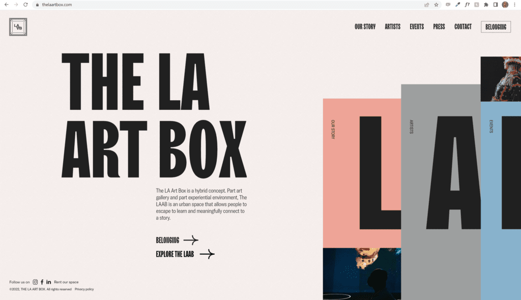
The landing pages hierachy: The first thing the viewer notices is the huge typeface confirming what site they are on. In addition to using big bold black typeface, they have alot of white space around, making it stand out even further. The subtle pink background is estetichally pleasing with the rest of the colors on the page, and readability is no issue.
After seeing the headline, the viewer briefly sees there is a paragraph and a few links underneath, before their eyes move to the elements on the right, with big letter and colors.
The websites hiearchy: U start of getting only the crucial information and some links to go to where they want you to go. All important links can be reached from the landing page, but you are given an option to click each and delve deeper into each subject. The entire webpage feels fluid and interactive, and guides the viewer seamlessly through the journey. There is always an option to go back to landing page using the icon top left on the screen.

The use of color on the page can be set up as shown above, with primary, secondary and accent colors. But is using color as code for the topic at hand. Hovering over the L on the pink color on the landing page, will dynamically change what you see and show the topic. Entering this page, will take you to a page that has the pink as background as a theme, with tints and shades of the color. This also applies for the rest of the secondary colors, while the accent collors are only shown as background boxes for off topic themes.


The site uses two similar fonts that are extremely versitale and and legible. TTTrailers is used as both H1 and as menu type, whilst GT America is used for bodytype, buttons and smaller headlines. TTTrailers is based on the concept of preserving the amount of white: when changing from thin to bold, the width of characters increases significantly, which ultimately allows you to save an equal amount of white inside and between letters. It was originally created to be used in movies and poster headlines.
GT America consists of 84 styles and 6 widhts to fill any need, and it pairs well with tttrailers.
The buttons, apart from the “home” button, are arrows part of GT America typeface. Diving into the site, they stick with this font for all their body text, and use Tttrailers for all headlines. Only the front page have GT america in use for headline.

