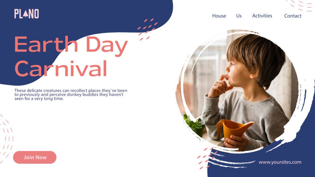
Brief:
Have a look at the design below:

Consider the following:
- Do you think it is accessible to users with eyesight trouble? Would they be able to read the text comfortably?
- What do you think of the labels of the main navigation? Do you think they are understandable and communicate clearly as to where they would lead a user?
- Do you think the contrast between the background and text colour is significant enough to be accessible?
Step 1
Do a straw test on the design by limiting your vision. Make your hand into a fist and look at your screen through the small space between your palms and fingers. Did you find it easy to read the information on the page?
Step 2
In your preferred design tool, recreate the website design. Pay close attention to the following:
- The text size of written content
- The colour usage and contrast. Text and elements should be easy to see and read.
- The labels should be understandable. The user should immediately know where they’ll lead them.
(You are welcome to change the look completely or stick to the current look and feel. Here is the Brand Style Guide and photograph).
Step 3
When you are done with your design, make your hand into a fist again and look through the small space between your palms and fingers to see if you can clearly read what’s on the page
Step 1:
I struggled readin gand understanding this before I even tried a fist test. It is not UU friendly at all. I have good eye sight, and if I am having difficulties reading it, I have no doubt people with eyesight trouble will not be able to fully read it.
Step 2 and step 3:
I wanted to keep the feel of the page and not change it too much. What I immediatly knew I had to change tho, was the text color versus the background. I used the color picker tool and created a color pallet, and simply changed the order around. I then tested the colors in https://color.adobe.com/nb/create/color-contrast-analyzer, which is a good place to check if you are using UU friendly design. I made the body text larger, as it was only 8 pt, and also changed the website link in the corner to a diff color and size. The font usage I didnt see an issue with, so I tried to find similar fonts, and only changed a bit on the kerning. I did not find any big concerns in the labels they had, I only changed phone call to contact, as this is more universally used.
After doing the fist test, I had no difficulty reading or seeing everything on the page.