
Brief:
For this task, you’ll be expressing meaning in typography and composition.
Question 1:
Create three different typographic compositions, showcasing your three words, one word per composition. In each composition, arrange each word to express its meaning, using only black and white. Consider all and any means at your disposal: dramatic scale contrasts, cutting, repetition, letter spacing, etc.
Question 2:
Create a new word, one which has no dictionary definition and meaning that you made up.
Then follow the same process as question 1 and create a composition using typography, to showcase and express the meaning of your word.
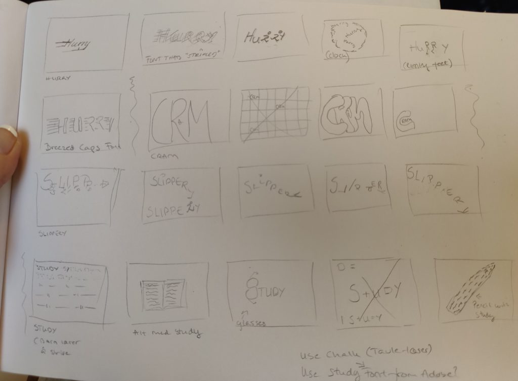
Reading the brief, I got excited about this task, playing with fonts, figuring out ways to alter letters, and thereby their meaning, is something I truly enjoy. We got a long list of words to choose our three from so I got started with some brainstorming and loads of chicken scratch and started slowly finding the words that suited me and that I could get the most out of. Below are some of my sketches (and notes).

The very first two illustrator typographies I made, were wrong according to the criteria/brief. I had completely misunderstood the task and had to start over. I will still attach them, as they gave me good practice in the use of gradient and mesh tool, something I have never used before. So it was not a waste 🙂


These are my final results

HOIST: I chose this word because as soon as I saw it, I had a multitude of ideas. in the end I decided to go for a very simple, but yet effective typography, as it explains the word very well. The font I chose is Building condensed medium as it is a strong and bold font and fits perfectly with construction and well, building.

CRAM: I had a few ideas for this word trying to use the entire page and “cram” the word in, but once I found this font where the C is so tight the pieces fell together. I place the word at the bottom left in a corner so to speak, to also have a cram feel. The font is called Bauhaus 93 regular .

SLIPPERY: I spent a long time searching for a perfect font to complement the “falling/slipping” L, and I landed on Chiller Regular. I feel like the uneveness of the letters fits the word and the falling down.

ERAMARK: This is my made up word. I made a lot of different ones, yet none of them felt right. The marks that still show after you have erased something on paper doesnt have a word for it as far as I know, so it was fitting to make one :). As for the font, I chose to use Helvetica Light Regular, a plain and good font to use for any situation in my opinion. This word didnt really need a spesific font so Helvetica was a natural choice.