

Question 1: Research and written:
- Having watched the video of Nigel French – describe, in your own words, what each of these colour systems means: RGB and CMYK. Add visuals to show the difference.
- Make use of Adobe Colour and develop four different colour schemes. Please hand in screenshots of your schemes:
- Monochromatic
- Complementary
- Tetrad
- Analogous
“Colour theory is, at its core, about developing aesthetically pleasing colour relationships”
-Color design workbook
Both RGB and CMYK are colour schemes used for mixing colour in graphic design.
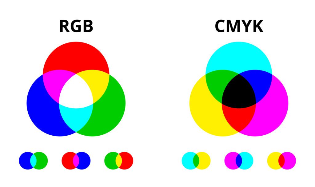
RGB
RGB stands for Red, Green and Blue. By combining these three colours any other colour can be made.
It is an additive colour process. This means that when the three colours mix, and as you add colours it goes from darkness to white.

Three flashlights shining on a wall from different angles. One with red, one with blue, and the third with green light, they will shine in their respective color where they stand alone. But where the three meet, the color will be white.
CMYK
CMYK stands for Cyan, Magenta, Yellow and Key. Key is also known as black. It’s called Key because it’s the main colour used to determine the image outcome. Black ink provides depth and shading, whereas the other colours create different colours on the spectrum depending on how they are mixed.
The CMYK model uses subtractive colours. This is where the background starts off white and as more colour is added it gets darker until it turns black.
CMYK is created with ink, not light like RGB. Cyan, Magenta and Yellow ink absorb (subratcs) red, green and blue light waves leaving our eyes to perceive what remains.
We could call it CMY because if you mix cyan, magenta and yellow together in equal and large amounts, it will create something like black. But due to impurities of the ink, true black is hard to recreate – that’s why printers include a black ink (K) along with the other colours. CMYK colours tend to be darker that RGB.
We always use CMYK for printing. If, however, your work is to be shown on screen, one would typically choose RGB with its richer and broader spectrum.
Adobe Color themes:
Analogous – Northern Lights

Complementary – Beach Days

Monochromatic – Winter skies

Tetrad – Pastel Beauty

Question 2: Practical
Use a colour photo of your choice and create the following colour effects, using Photoshop. You should hand in four separate works of the same photo with the following effects:
- Create a fluorescent duotone using a Gradient Map adjustment layer.
- Apply a monochrome look (choose a different colour than black/greyscale).
- Split toning of the image (note that the tool in Photoshop for ‘Split Toning’ was changed to ‘Color Gradient’).
- Freestyle: Create a colour effect of your choice.
This was a difficult task for me, as I am very new to photoshop, and I never had much experience with photographs or colours. I did the research and followed guides, but still feel like my results were over the top and at some point plain silly. I spent some time tweaking and testing different methods within photoshop and finally came up with the following pictures.

Original Photo chosen

Fluorescent duotone

Monochrome look

Split toning of the image

Freestyle. (attempt at turning it into nighttime)