Brief:
Compare the design (in terms of pace and contrast) of an online magazine, blog or website to that of a printed magazine, book or journal.
- What differences can you see between the kinds of design strategies used in the two formats?
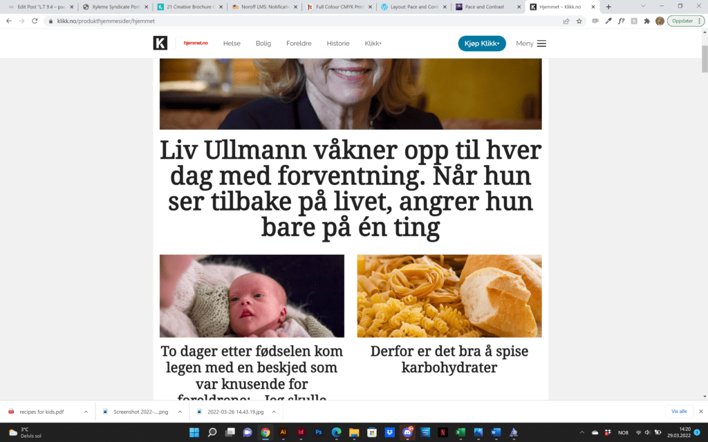

Since the magazine I had was Hjemmet, I decided to use their online magazine for this comparison, to easier spot the differences between them. Personally, I feel like the printed magazine feels like a book almost, where images are overpowering and text is sparse. The online magazine gives more of a newsfeed feel. This is what I see when I read online news. A picture with a headline that grabs your attention. The online magazine mainly uses a 2 column grid, with some 3-column parts weaves in. They all have a Picture with a headline beneath it. The printed magazine has a 4-column grid and an image that demands attention. The strategy for the online magazine I think is to grab your attention fast, so you will want to read what’s in the link. The printed magazine, however, wants you to spend time reading and looking at the images. They also provide quotes and tips that are decorative and make the design look better.